Generates lift and cumulative gain performance table and plot
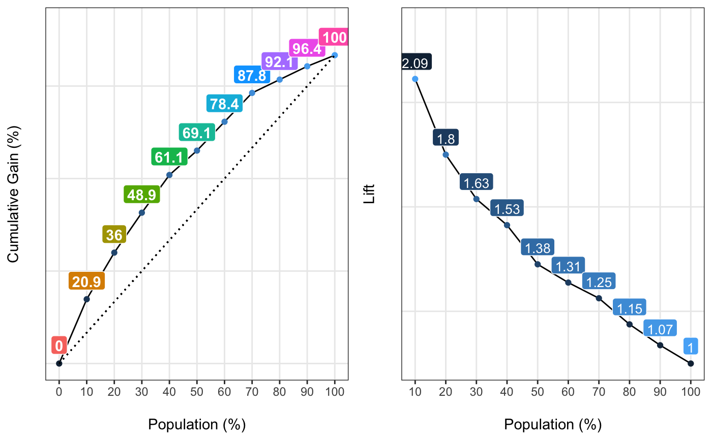
gain_lift.RdIt retrieves the cumulative positive rate -gain curve- and the lift chart & plot when score is divided in 5, 10 or 20 segments. Both metrics give a quality measure about how well the model predicts. Higher values at the beginning of the population implies a better model. More info at: https://livebook.datascienceheroes.com/model-performance.html#scoring_data
gain_lift(data, score, target, q_segments = 10)
Arguments
| data | input data source |
|---|---|
| score | the variable which contains the score number, or likelihood of being positive class |
| target | target binary variable indicating class label |
| q_segments | quantity of segments to split score variable, valid values: 5, 10 or 20 |
Value
lift/gain table, column: gain implies how much positive cases are catched if the cut point to define the positive class is set to the column "Score Point"
Examples
fit_glm=glm(has_heart_disease ~ age + oldpeak, data=heart_disease, family = binomial)
heart_disease$score=predict(fit_glm, newdata=heart_disease, type='response')
gain_lift(data=heart_disease, score='score', target='has_heart_disease')#>    Population   Gain Lift Score.Point
#> 1          10  20.86 2.09   0.8185793
#> 2          20  35.97 1.80   0.6967124
#> 3          30  48.92 1.63   0.5657817
#> 4          40  61.15 1.53   0.4901940
#> 5          50  69.06 1.38   0.4033640
#> 6          60  78.42 1.31   0.3344170
#> 7          70  87.77 1.25   0.2939878
#> 8          80  92.09 1.15   0.2473671
#> 9          90  96.40 1.07   0.1980453
#> 10        100 100.00 1.00   0.1195511